Rebrand
Nimki
Industry: Lifestyle, Beauty & Gifts
A lifestyle store bursting with colour, creativity, and the simple joy of self-care.
What began as Spellbound Apothecary (Emily’s line of handmade aromatherapy skincare, bath bombs and haircare) soon outgrew its name. With a vision that stretched beyond her own creations, Emily wanted to create a space that celebrated not just her products, but the wider world of makers she admired. Nimki was born: a rebrand that transformed her apothecary roots into a joyful lifestyle and gift store.
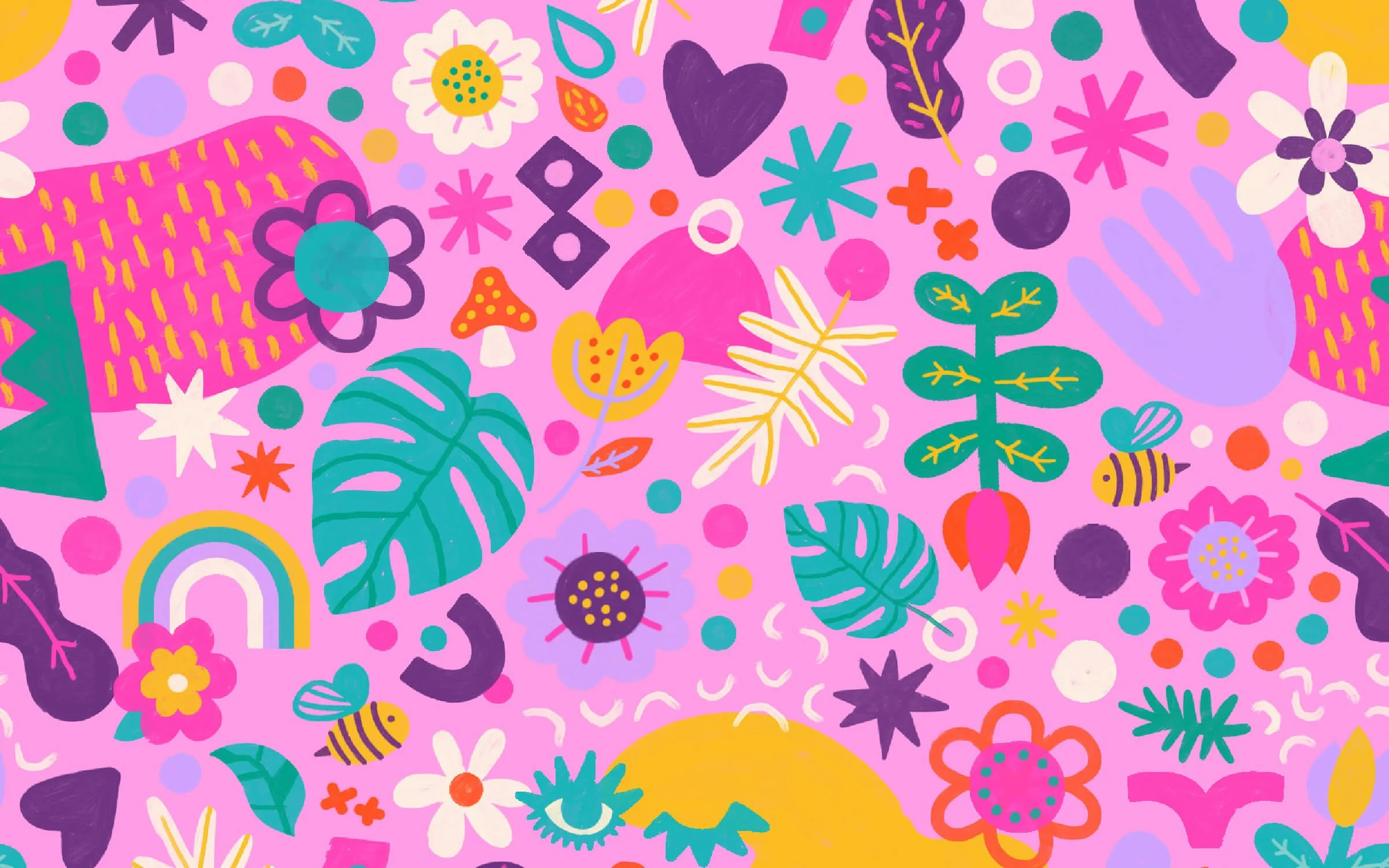
The new identity needed to capture Nimki’s ethos: playful, inclusive, and brimming with creativity. We built a brand that feels like stepping into a technicolour world of self-care and community connection. A custom wordmark, softened with flower accents, anchors the system. Surrounding it, bold patterns, retro-inspired shapes, and vibrant graphic assets bring a sense of fun and freedom.
Illustrated value badges champion what Nimki stands for, while patterns and icons flex seamlessly across packaging, social media, and in-store touchpoints. The palette leans bright and unapologetic, celebrating pinks, oranges, teals, and purples in combinations as eclectic as the products themselves.
The result is a brand that feels like a party for the senses: full of colour, community, and care. Nimki’s identity doesn’t just hold space for Emily’s handcrafted goods, but lifts up other makers too – turning a simple shop into a hub of creativity and joy.
The toolkit
Brand foundations: Logo suite, typography system, colour palette, brand guidelines
Creative assets: Badges, patterns, illustrated mascot, custom gifs
Rollout: Email signature, social media templates (Canva), newsletter template (Mailchimp), magazine ad, gift box packaging, market stall backdrop
Photography by Sister Scout Studio
Interested in branding for your retail, hospitality or product business?