Rebrand
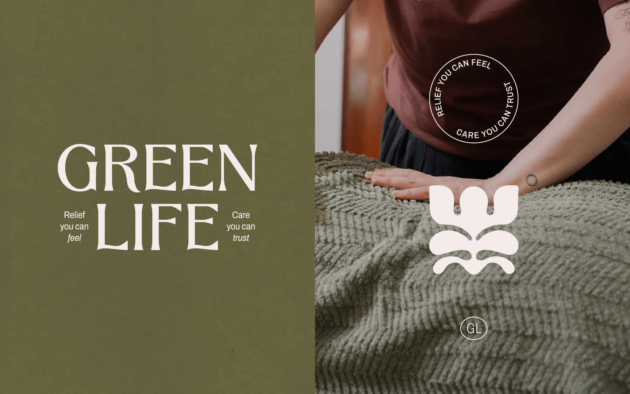
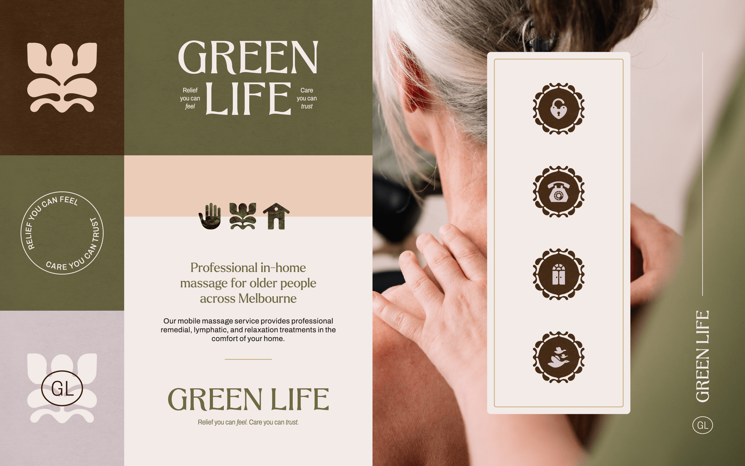
Green Life
Industry: Health & Wellbeing
A massage brand built on heart, trust, and the simple power of care.
Green Life specialises in remedial massage for elderly clients and those with complex needs, supporting not just physical health but emotional wellbeing. With a reputation for genuine relationships and reliable care, the business was ready to grow its presence with an identity that could hold its own in a sector crowded by clinical, impersonal brands.
The challenge was clear: most competitors leaned on sterile visuals and cold tropes, failing to reflect the warmth and trust that older clients and their families need most. Green Life required a brand that spoke equally to clients, families, and case managers – professional enough to be credible, but human enough to feel safe and welcoming.
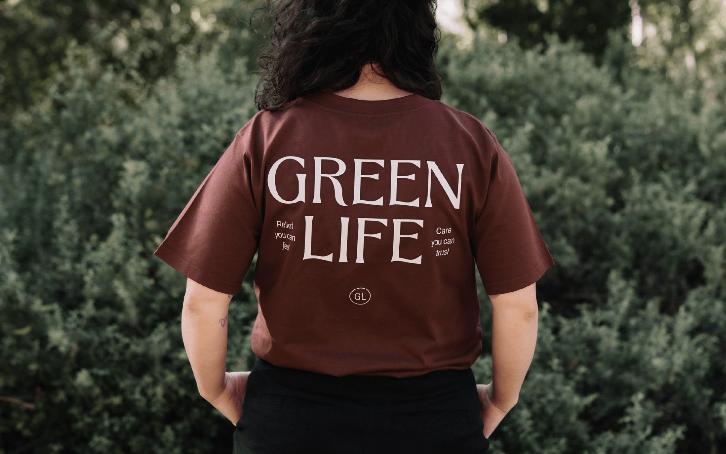
We began with the heart of the brand: care that connects. The new identity pairs a handcrafted wordmark, inspired by vintage botanical printmaking, with modern supporting elements that symbolise growth and renewal. Three primary icons anchor the system – Human, Bloom, and Home – representing connection, resilience, and comfort.
The palette centres on a grounding olive green, supported by earthy neutrals that replace cold, clinical tones with something warm, approachable, and deeply human. Every element works together to communicate both the emotional and physical impact of care – a brand that feels as safe as it does professional.
The result is an identity that feels calm, considered, and quietly strong.
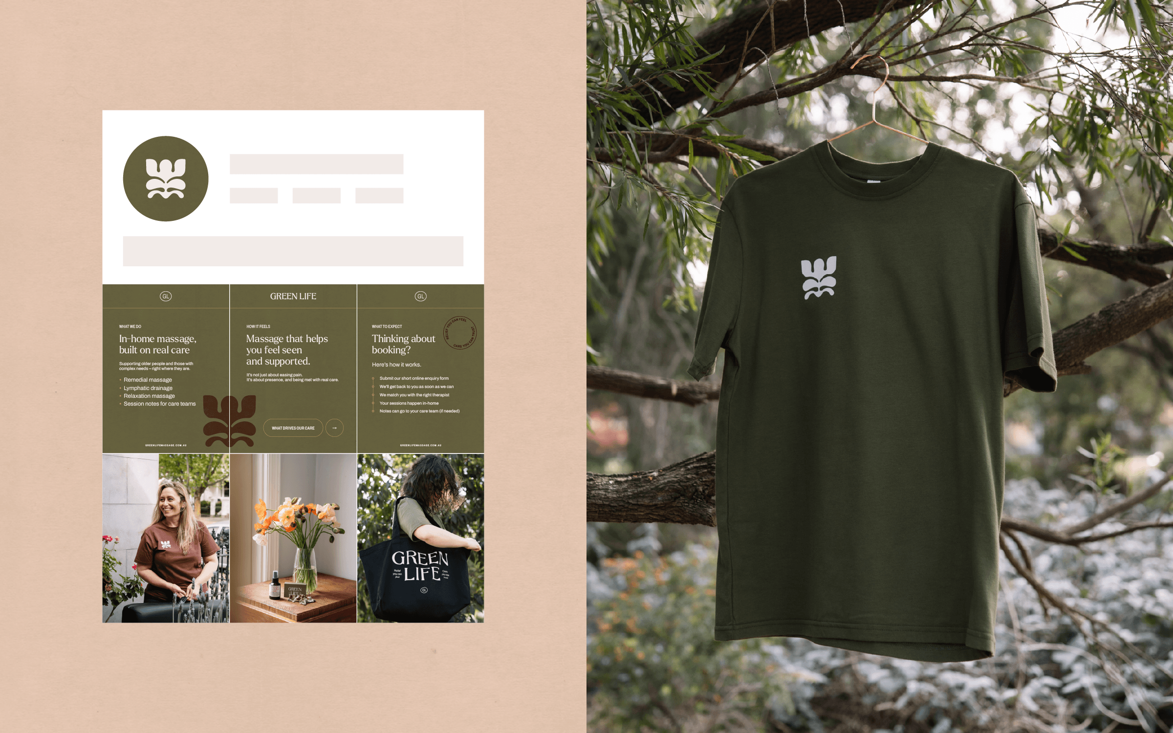
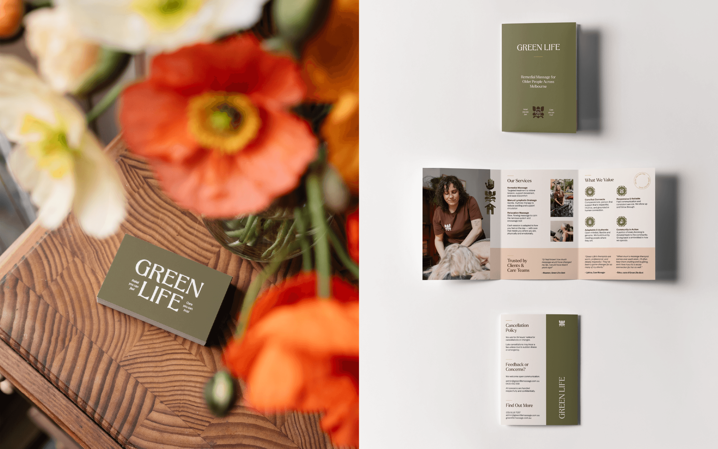
The toolkit
Brand foundations: Logo suite, typography system, colour palette, brand guidelines
Creative assets: Primary and secondary icons, textured backgrounds
Rollout: Brochure, T-shirt, business card, email signature, newsletter template (Mailchimp), Instagram banner, letterhead, presentation template (Powerpoint), sympathy card, workbook templates (Google Docs)
Photography by Phoebe Powell
Interested in branding for your holistic wellness business?