
Nimki
Rebrand Case Study
Background
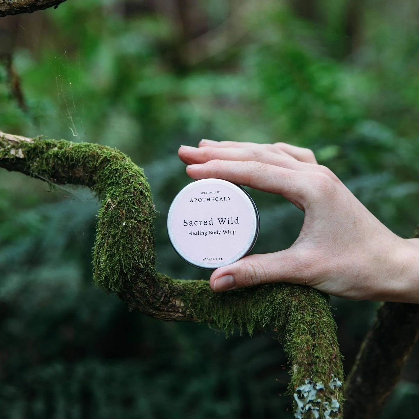
Founded by Emily Williams, Nimki started life as Spellbound Apothecary, an online shop specialising in handmade botanical skincare that is 100% vegan and cruelty free. Her range of products focus on celebrating self-care in a fun, joyful way that respects your body and the earth. Emily was also selling her products at markets, she loved having meaningful interactions with her customers and curating her stall to be a place of joy and exploration. This love of community (and wanting to experiment and expand on her product collection) put her on the path of realising her vision to transform her business to include a brick and mortar store. It was at this point that she came to me to help realign her branding with her new vision.


The process
Getting to know you
Emily completed my homework form and we jumped on a call to talk through her answers and inspiration. While she loved her original branding she felt that she had outgrown it, the business was heading in this expanded direction and she didn’t feel it represented where it was going. It was earthy and natural, with a focus on the herbal element. Emily wanted to hone in on creative self expression and sparking moments of joy. She wanted her new branding to be quirky, playful and full of fun.
After the call, I created an insights sheet that highlighted the vision for the business, core values, people that she loved to work with and how she wanted them to feel when interacting with Nimki.
Insight sheets are an important part of my collaborative process, as they ensure that we are united in our vision for the branding. I want your branding to be a true reflection of your vision and the best way to do that is to have you with me every step of the way.
Once I’d sent the insights through and it was all approved, it was moodboard time.

It’s a mood(board)
Moodboards are great for creative brainstorming before delving into the design. They are a wonderful way to showcase ideas and communicate big-picture concepts. In a rebrand project, I create two moodboard streams, with each direction focusing on different facets of the business.
One of the first things I do when creating a moodboard is come up with a colour palette and match all my references. The benefit of doing it this way is that we can visualise how the brand might look, but also it makes it much easier to separate what we like and don’t like more quickly. Because if everything is in similar colours then you can really focus on the style of the typography and the graphic assets.
Once I’ve tied everything together I like to record a Loom video to go into detail about my thought processes and ideas for our project. I find this to be the most effective way for my clients to take in all the information in their own time (and refer back to it) but also it’s a wonderful way for me to communicate why I’ve made specific choices.
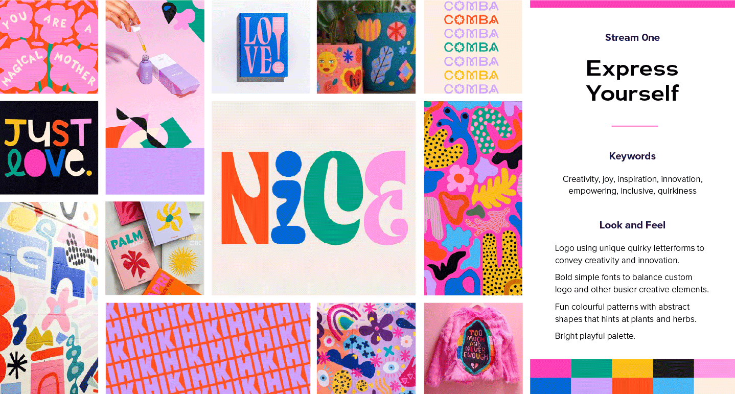
For Nimki the two strategies I focused on were creative self expression and taking care.
Moodboard walkthrough snippet
For “creative self expression” I wanted to highlight the creativity and innovation of the products, but also how that applies to the people buying them - the joy and empowerment of finding something that makes them feel creatively inspired. To visualise these concepts I created a bright playful colour palette and sourced logos that used unique quirky letterforms. I complemented these with colourful abstract patterns I found on Pinterest with the idea that anything we created would have subtle references to plants and herbs. This direction was bright, joyful and full of creativity.
For “taking care” I wanted to highlight the importance of creating time to celebrate yourself with beautiful products but also the warm, welcoming and engaging space that Emily was creating for people to explore their creativity. To visualise these concepts I created a deep warm palette and sourced retro-inspired logos that embodied the optimism of the late 60s. These were paired with textural patterns and retro flowers to embody joyful feelings of nostalgia. This direction felt engaging, hopeful and organic.
I sent both moodboard concepts and the Loom video to Emily, then gave her space to process them in her own time, with a scheduled call later that week.
On our call, we went through the concepts, talked about what Emily felt drawn to and what wasn’t working for her. My branding process is super collaborative, I want to hear my client's thoughts, because if they can’t see their vision in the branding then I haven’t done my job correctly.
There were elements of both that she liked.
Sidenote, this happens all the time and it is totally fine! Nothing is cut and dry, both concepts are the extreme of a strategy and are a way for me to get a temperature check rather than a concrete set of absolutes.
We went with stream one but simplified the logo direction, slightly tweaked the colours and added in a few elements from stream two.
Stop. Logo time!
If you are thinking that seems like a long process, you’d be right. But the idea is to make sure we are on the same page and designing this brand together. I think it’s so important to put this prework in before designing, because then when the logo concepts come in you know what to expect. After all, you helped make the decisions.
In a rebrand, I create two logo concepts (with corresponding submarks), two font systems (headings, body copy, hierarchy) and one visual strategy (patterns, motifs, illustrations, etc). I then put all these elements into a look and feel pdf so you get an idea of how the branding would be applied in the wild - no guessing games here. I then record another Loom video to go over the design details and schedule a chat to talk through it.
For Nimki, the first logo concept is a simple rounded sans serif font, with a modified ‘K’ that has a bouncy bubbly look. It’s friendly and fun, and being all lowercase feels approachable. Its simplicity means that all the other elements can shine, and as you can see by the look and feel page, there are a lot of big personalities in the design assets. I was also conscious that Emily needed to create a lot of different packaging, so having a versatile logo was really important.
The second logo is a wide sans serif with a mixture of uppercase and lowercase letters. This mix of letters creates a quirky unconventional feel because it doesn’t play by the rules. The wide spacing between the letters feels expansive and welcoming because it feels like there's room to move.
We talked through the concepts and while Emily was drawn to number one, she felt it needed something extra, so we decided to play with the shapes of the dots above the “i”. The hero pattern also didn’t feel 100% there yet. She loved the elements but it was missing something. So I decided to change it from hard lines and solid colours to a more painterly approach. And with those changes, we were onto a winner!
Logo concept walkthrough snippet


Roll out
Style Guide
A brand guideline or style guide is key to making sure you create consistent visual assets - from packaging to your website - this document is your branding bff. The guideline covers: how to use your logo (clearspace, minimum sizes, colours, alternatives), brand values, typography (styles, hierarchy), colour (print and digital, contrast accessibility guidelines, combinations), visual elements (patterns, graphics, icons, illustrations) and a look and feel guide. Your one stop branding shop.
Collateral
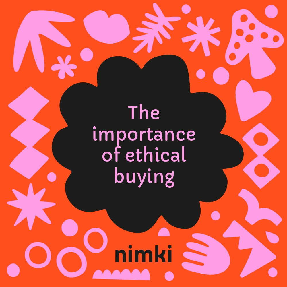
One of my favourite parts of the branding process is creating unique collateral from the branding assets and Nimki was so much fun. Together Emily and I have created social media canva templates, packaging, gifs, web icons, email signatures, signage and more.
Check out some of the examples below.


It was so lovely to help Emily reimagine her brand.
Go and check out her beautiful joyful space!
70 High St, Northcote VIC 3070

Nimki’s gorgeous website was designed by Lexi from Pixi Site.
All of the stunning images above were taken by Sophie from Sister Scout.